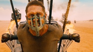
 It seems like everybody has been talking about Mad Max: Fury Road lately, and here at Clockpunk Studios we’re no different. There’s a lot to say about Fury Road, from its characters to its themes and beyond. Like anything that catches the Internet’s attention, it has already given rise to memes, and a host of unusual product reviews for silver spray frosting. Chuck Wendig wrote about how it breaks accepted writing rules, and Wendy Wagner discussed the way that the visuals in Fury Road convey information to the viewer, what Guillermo del Toro calls “eye protein.” But how can we use it to segue into a conversation about author websites?
Well, let’s go back to that “eye protein” idea. Del Toro uses it as an alternative to eye candy, and it’s hard to argue that the imagery in his films is very carefully coded to produce specific effects, whether it’s the humans in Mimic being lit with golden hues to give the impression of insects trapped in amber, or the color coding of characters in in Pacific Rim. Colors, shapes, and patterns are deployed in Guillermo del Toro’s movies to do more than look nice; they convey information. They tell the viewer that things are connected, breathe life into the world.
“Eye protein” lets you build your own engagement with the images that you’re seeing on the screen, lets you build up the world from tidbits and details, rather than a big dump of exposition. It can create tension with contrasting colors, or tell you about character relationships with repeated visual motifs.
As writers, we tend to be very concerned with words. Words are our bread and butter, after all, they’re how we create our worlds, how we tell our stories, and how many of us make our living. So where does “eye protein” come in? Well, think about the cover of your book. You want it to do a whole lot more than look nice, right? You want it to pull in the reader, let them know enough about what they can expect from the story inside that they’ll pick it up and start reading. Well, the same is true of your website.
A great website does more than just look good. It tells people a little bit about you, what you write, who you are, and it does that without them having to read even a single word. The right choice of color, design, and image can serve the same purpose as “eye protein” in a film. They can let visitors to your site start making connections from the moment they click through. If the design choices are done right, then visitors to your site will feel an immediate sense of understanding of you and your work. Then the layout and functionality of your site will make it easy for them to make the leap from that initial feeling to a deeper exploration of your site’s content. They’ll stay engaged, they’ll read, and maybe they’ll even buy a book. The difference between good design and bad can be the difference between a visitor who sticks around to read, and one who clicks on past.
Once they start reading, then your words can work their magic, but first you’ve got to hook them in. A website chock full of “eye protein” from Clockpunk Studios can help do just that!